
Short answer
Citroën is an example because its 2022 emblem deliberately returns to the oval surrounding the original chevrons. Peugeot revives the lion-head shield, while Renault revisits line-based treatments of its diamond.
- Data period
- Historical emblem origins and documented redesigns
- Entries
- 3
- Comparison
- Editorial order
- Topic
- Logos & hidden meanings
Car Logos Reviving Historic Designs at a Glance
| Brand | Emblem or meaning | Origin |
|---|---|---|
 | Original oval reinterpreted | 1919 oval badge |
 | Lion-head shield revisited | Earlier lion-head shield |
 | Line-based diamond revisited | Earlier line-based diamond designs |
No entries match your search.
Car Logos Reviving Historic Designs: Entry Details
Citroën
2022 redesign · Original oval reinterpretedThe vertical oval returns around the chevrons. The change explicitly reconnects the identity with the first badge while enlarging the central forms.
- Origin
- 1919 oval badge
Peugeot
2021 redesign · Lion-head shield revisitedThe head replaces the complete lion as the centre of attention. A shield returns an earlier graphic idea to the current identity.
- Origin
- Earlier lion-head shield
Renault
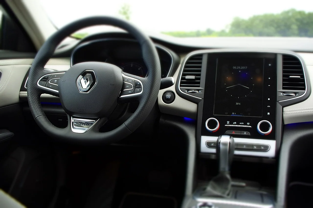
2021 redesign · Line-based diamond revisitedInterlocking lines replace the previous metallic appearance. The treatment recalls earlier striped diamonds and makes motion part of the identity.
- Origin
- Earlier line-based diamond designs
Car Logos Reviving Historic Designs: Analysis
Citroen Oval Logo History
Citroën restored an enclosing shape rather than merely redrawing the chevrons. The oval makes the connection with André Citroën’s first badge visible, while larger chevrons give the emblem a different presence on modern vehicles.
Peugeot Lion-Head Shield Revival
Peugeot’s new lion-head shield recalls an earlier head-only badge. The switch from a full animal to a cropped head changes the focal point, giving the face and mane more space. The Peugeot logo archive shows the older forms.
Renault Diamond Logo History
Renault kept the diamond while replacing its metallic treatment with interlocking lines. Earlier Renault emblems had also used lines, allowing the new design to look backward while working more easily in animation.
Renault’s new diamond appeared on the Renault 5 Prototype, joining an emblem revival with a familiar model name. The Renault logo history traces how the same basic shape can support very different graphic treatments.
FAQ: Car Logos Reviving Historic Designs
Why did Citroën bring back the oval logo?
Citroën wanted a visible connection with its first identity. The oval surrounds larger chevrons and provides a more prominent signature for new vehicles.
When did Citroën announce its new oval badge?
Citroën announced the identity in September 2022. The plan called for a gradual rollout to future products rather than changing every existing badge immediately.
Is Peugeot’s new lion logo based on an older design?
The lion-head shield recalls a previous Peugeot badge. The company had already used a head-only lion before returning to a complete animal in later designs.
Why did Renault remove the metallic look?
Renault designed the line-based diamond for a wider range of uses, including movement and digital media. The new treatment also draws on earlier graphic versions of the diamond.
Are these exact copies of old car logos?
Citroën, Peugeot and Renault reinterpret earlier shapes. The oval, lion head and lined diamond reconnect with the past while their proportions and execution change.
Sources & methodology
Manufacturer announcements establish the changes and announcement dates.
Maintained by Artsiom Dusau, a software engineer and BMW 4 Series owner. Editorial policy