
Short answer
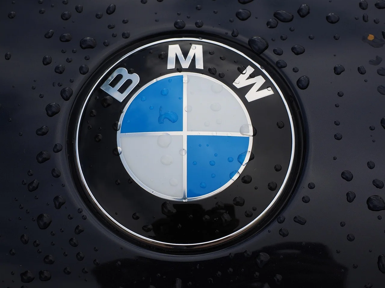
BMW uses a transparent communication logo designed for varied digital settings. Nissan, Volkswagen and Renault also simplify familiar emblems, using lighter forms or flat graphics to extend their identities across different media.
- Data period
- Historical emblem origins and documented redesigns
- Entries
- 4
- Comparison
- Editorial order
- Topic
- Logos & hidden meanings
Car Logos Redesigned for Digital Use at a Glance
| Brand | Emblem or meaning | Origin |
|---|---|---|
 | Transparent communication mark | Transparency and media flexibility |
 | Lighter physical and digital identity | Physical and digital continuity |
 | Flat two-dimensional roundel | Reduced essential forms |
 | Animated line-based diamond | Animation and continuous movement |
No entries match your search.
Car Logos Redesigned for Digital Use: Entry Details
BMW
2020 communication redesign · Transparent communication markA transparent version opens the roundel to surrounding backgrounds. Its launch was specifically for communications rather than a wholesale replacement of vehicle badges.
- Origin
- Transparency and media flexibility
Nissan
2020 redesign · Lighter physical and digital identityThe simplified form was designed to work across vehicles, dealerships and online contact. Nissan linked it with a connected retail experience.
- Origin
- Physical and digital continuity
Volkswagen
2019 redesign · Flat two-dimensional roundelThe roundel loses simulated volume while retaining its essential letters and circle. The simpler construction supports flexible placement.
- Origin
- Reduced essential forms
Renault
2021 redesign · Animated line-based diamondThe diamond is formed from interlocking lines rather than metallic surfaces. Renault designed the flat treatment to work in motion as well as still images.
- Origin
- Animation and continuous movement
Car Logos Redesigned for Digital Use: Analysis
BMW Transparent Logo Design
BMW removed the solid outer background in an additional transparent communication version. That lets the surrounding image or colour become part of the mark’s presentation. The 2020 announcement assigned it to media branding, while vehicle and dealership badges retained their existing form.
Nissan Logo on Screens and Dealerships
Nissan designed its lighter logo for both physical and digital settings. The company connected the change with a retail experience that moved between online contact and dealerships, as the Nissan emblem history puts into context.
Volkswagen and Renault Flat Logo Designs
Volkswagen reduced its roundel to essential two-dimensional elements. The change keeps the letters and circular outline familiar while removing the simulated depth that had shaped its previous presentation.
Renault’s interlocking lines support movement, including animated sequences. The Renault logo history connects that digital flexibility with older line-based diamonds rather than a completely new symbol.
FAQ: Car Logos Redesigned for Digital Use
Why did BMW make its logo transparent?
BMW designed an additional transparent version for flexible communication use. The open background allowed a different relationship with the images and colours around the emblem.
Did BMW’s 2020 logo replace the badges on cars?
The 2020 announcement specified communication use. Existing vehicle and dealership marks were retained at that launch.
Why did Nissan simplify its logo?
Nissan wanted a lighter form that could work across physical and digital settings. Its rollout connected online interactions, dealerships and vehicle identity.
When did Volkswagen introduce its flat logo?
Volkswagen presented the flat two-dimensional logo in 2019. The roundel kept the core letters and outline while reducing the design to essential elements.
How does Renault’s diamond work in animation?
The interlocking lines suggest a continuous path and movement. Renault’s design announcement explicitly describes uses in video, digital media and vehicle welcome sequences.
Sources & methodology
Manufacturer announcements establish purpose and timing. BMW’s 2020 communication mark is treated separately from vehicle badges and later designs.
Maintained by Artsiom Dusau, a software engineer and BMW 4 Series owner. Editorial policy